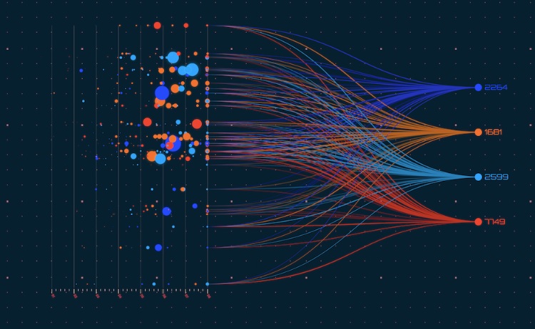
Data visualization is a powerful tool in data analytics, transforming complex information into easily comprehensible graphical representations. These visualizations, from charts and graphs to heat maps, are pivotal in aiding data-driven industry decision-making. The essence of data visualization lies in its ability to present data in a manner that swiftly conveys insights and facilitates informed choices.
In a world where organizations receive vast amounts of unstructured data from diverse sources and multiple formats, data visualization brings order to this chaotic influx. It empowers organizations to extract valuable insights from intricate datasets and utilize them as guiding beacons for effective decision-making. Data visualizations are frequently integrated into dashboards, where they serve to highlight trends, track key performance indicators (KPIs), and unveil outliers and data patterns.
The significance of data visualization extends beyond its ability to make data more understandable; it can significantly expedite data exploration, unveiling hidden trends, patterns, and relationships that might be concealed within raw data. It is the catalyst that transforms data into actionable intelligence.
However, not all data visualizations are created equal. Effective data visualization practices can lead to sound decisions, while subpar ones may result in misguided actions. In this article, we will delve into the dos and don’ts of data visualization in 2023 to help you navigate the world of data-driven insights more effectively.
Dos – Data Visualization Best Practices
1. Choose Your Data Visualization with Purpose
Before selecting a type of data visualization, it is crucial to have a clear goal. Understand what you want to convey: a comparison, composition, trend analysis, status tracking, progress assessment, or deviation identification. Choose your visualization method accordingly. A well-defined purpose ensures that your visualization aligns with your objectives.
2. Give Just Enough Information
Data visualization is all about storytelling. To ensure your data story is crystal clear, provide your audience with enough information to grasp the message. Label your charts, specify axes, and ensure legends are displayed where applicable. Clarity is paramount in effective data communication.
3. Choose Your Colors Wisely
Deliberately select colors that enhance your visualization. Opt for a distinct color palette that differentiates data elements and adds meaning to the visualization. If your visualizations will be used in printed reports, test how they appear in grayscale to avoid color-related issues.
4. Follow Known Color Conventions
Stick to established color conventions, such as green representing positive values and red indicating negative values. These conventions provide viewers with immediate comprehension and consistency.
5. Keep the Design Simple
Complexity can hinder understanding. Keep your data visualizations clean and straightforward. Remember that the ultimate goal is to present information in an easily digestible manner. Simplicity accelerates data comprehension.
6. Include a Baseline
For column charts, always start the y-axis at zero. Omitting the baseline can lead to a skewed interpretation of data. The baseline sets a reliable reference point for accurate analysis.
7. Keep All Text Legible
To ensure comprehension, maintain legibility in all text elements within your visualization. Avoid the need for viewers to strain their eyes to read labels or annotations.
8. Ask for Feedback and Optimize Over Time
Once your visualizations are integrated into your reporting, seek feedback. Is your data story clear? Are labels and text legible? Fresh perspectives can unearth overlooked details, leading to continuous improvement.
Don’ts – Data Visualization Mistakes to Avoid
1. Don’t Choose Your Data Visualization at Random
Randomly selecting a visualization without thoughtful consideration can muddle your data story. Each type of visualization has a purpose; choose one that aligns with your goals. For instance, using a pie chart to display trends might confuse your audience; a line chart would be more suitable.
2. Don’t Give Too Much Information
Avoid overwhelming your audience with an abundance of unnecessary or irrelevant details. Focus on what your audience needs to know and exclude extraneous information. Cluttered visualizations hinder comprehension.
3. Don’t Use Troublesome Colors
Steer clear of colors that are too similar or overly vibrant, or utilize patterns and textures as fills, as these can create confusion and make your visualization appear busy.
4. Don’t Break Known Color Conventions
Resist the temptation to reverse established color conventions, such as using green to signify negative values or red to represent positive outcomes. Consistency is key for viewer understanding.
5. Don’t Use 3D Effects
Avoid using 3D graphics, as they complicate visualizations, making them challenging to read and potentially misleading. Steer clear of effects that distort proportions or reduce comprehension.
6. Don’t Truncate Axes
Refrain from truncating the y-axis in column charts, as this can distort data representation and mislead your audience. Exceptions may apply to line charts designed to emphasize trends.
7. Don’t Make it an Eye Test
Employ font sizes and styles that are easily readable. Viewers should not need to strain their eyes to decipher text within your visualization.
8. Don’t Let Your Data Visualizations Go Stale
Business is in a constant state of flux. Periodically audit your dashboards to assess whether your chosen data visualizations still provide value. Optimize or eliminate outdated visualizations to ensure continued relevance.
In conclusion, mastering data visualization involves carefully balancing purposeful design and avoiding common pitfalls. Following these dos and don’ts will empower you to create meaningful and effective data visualizations in 2023, facilitating better-informed decisions and enhancing your data-driven journey.


